Comments/Ratings for a Single Item
This morning I had a transparent menu bar in Safari on my iPad. Also, the color scheme switcher was not working in Safari or Edge. But in Firefox, the menu bar was not transparent, and the color scheme switcher worked. After clearing the cache for Safari, the menu bar was no longer transparent, and the color scheme switcher worked. Clearing the cache also got the color scheme switcher to work in Edge.
I have no more trouble with these red and transparent issues.
This page now has a more nocturnal logo when you switch the color-scheme to Dark.
The fonts are not from Yahoo! and have never been.
This was an exclamation, such as Uhh!
Now links are normal btw…)! Thanks)
The Dark color scheme seems to be looking good now. The next thing to do is to set cookies when someone selects a color scheme. After that, I'll make System the default, and with that set, the Dark color scheme will go into effect for those whose browser has a dark color scheme. Until then, Light remains the default, and you can see the Dark scheme on a page-by-page basis with the Tools menu.
Some details needing fixing are the colors used in Interactive Diagrams. I added some CSS to turn the red bar at top to maroon for the Dark color scheme, because it contrasts better with light text. But it also has some onclick u tags colored blue. To match other links, these should be colored "color-mix(in oklab, currentColor, blue)".
Link colors are as follows for both the Light and Dark schemes:
unvisited links: color-mix(in oklab, currentColor, blue)
visited links: color-mix(in oklab, currentColor, indigo)
hovered over or focused on links: color-mix(in oklab, currentColor, green)
The purpose of using color-mix is to make sure the text properly contrasts with the background no matter whether it is dark or light. The currentColor value is the color of the text, which will either be black for the Light scheme or off-white for the Dark scheme. Using color-mix will blend this color with blue, indigo, or green to get either a light or dark version of these colors, depending upon what is needed.
Blue was chosen because it is the traditional link color. Indigo was chosen to contrast with blue without drawing more attention to itself. We were previously using another shade of blue, and I couldn't tell which links were visited and which were not. It should now be more obvious, because the contrast between blue and indigo is stronger. In global.css, I had started changing the background color for hovered links, and in globalindex.css, the text to hovered links was being changed to red. I decided to not change the background color, because to do this effectively, I would need to do a color-mix with the background color, and while CSS gives me the text color with currentColor, it does not provide the background color with something like currentBackgroundColor. So, to change the background color, I would have needed more complicated CSS. Instead, I decided to change the text color, but since red means stop and green means go, I replaced red with green.
It would still be nice to keep a global light/dark option in the tools menu
I think I spoke too soon. There are still areas of the site, such as search forms and Game Courier, that need to be adapted to the Dark color scheme. And in the meantime, I haven't gotten it to properly save a cookie yet. I did save one with JavaScript, and phpinfo reported on its value, but $_COOKIE did not include it, and JavaScript also didn't recognize it.
It would still be nice to keep a global light/dark option in the tools menu
I'm not planning on getting rid of that. When it is working, it will have three options – System, Light, and Dark – and if System is selected, it will go with whether the browser has light or dark mode set.
- What is with fonts? Almost all fonts are now Georgia. Exception is Game Courier logs page which keeps previous fonts.
- For me dark theme doesn’t work.
- Markers for Private and Members-Only are disabled. There’s no way to distinguish published pages and WIPs with unpubs.
In the game descriptions, a prefix word(s) saying 'Private' or 'Members-Only' has been almost unnoticeably added, in the headers to Comments.
Personally I don't quite like the Dark Olive(?) colored headers used for Comments (makes the words in black or dark blue a bit hard to see for me on my laptop anyway). I was tempted to ramble on about the subject of change again, maybe adding a link to YouTube video for Sheryl Crow's song 'A Change Would Do You Good', or Shrek's line 'Change is good, donkey'. In spite of how I feel about changes generally stinking in my life...
Personally I don't quite like the Dark Olive(?) colored headers used for Comments (makes the words in black or dark blue a bit hard to see for me on my laptop anyway).
On mine as well. The general hue is fine; a lighter shade would be much better.
What is with fonts? Almost all fonts are now Georgia. Exception is Game Courier logs page which keeps previous fonts.
It wasn't Georgia on my computer, though it could have been on yours. Apparently, the section defining the font variables was accidentally deleted from one of the CSS scripts. But it was still in the other one, and I copied it over. Doing that fixed the fonts when I refreshed the cache.
For me dark theme doesn’t work.
At present, it works only if you select it from the menu. But make sure you clear your cache, which I know is more troublesome on Safari for the iPhone than it is for Firefox on my desktop. You have to do it from the Settings app, and it doesn't give you the option of clearing it for just one website. I would recommend installing another browser that you can use this website on. Both Edge and Firefox will give you the option of clearing the cache from the browser's own settings instead of the Apple Settings app.
Markers for Private and Members-Only are disabled. There’s no way to distinguish published pages and WIPs with unpubs.
I saw that on Edge on my desktop, though not on Firefox. I don't know what is going on yet but will look into it further.
The issue was that the light-dark() CSS function, which I was using to provide different highlight colors for light and dark mode, is not supported on Edge or Safari. So instead of using it, I defined the colors with each color scheme and used a CSS variable with each. Doing this fixed it for both Edge on my desktop and Safari on my iPad.
There is still some work to do on the Dark color scheme, but I do now have it working for when you have set a preference for dark mode in your browser but not on the site. You may use the option in the Tools menu to change your preference to Light if you want to keep your browser preference for dark mode without using the Dark color scheme for this site. To save your preference, you will have to click the Save button, which will run a PHP script to set a cookie with your preference stored in it. You may also have to refresh your cache before pages display properly.
I had wanted to represent each color scheme only once in the CSS, but I got it to work by representing the Light scheme once and the Dark scheme twice. The Light scheme is the default, and it will be overwritten with the Dark scheme under either of two conditions. One is when you have set a preference for a dark scheme in your browser, and you have not overridden this preference by selecting the Light scheme for this site. The other is when you have specified a preference for this site's Dark scheme. Since preferences on the site override preferences set in the browser, this condition is kept less complicated. The System color scheme is now the default, and this tells it to use the browser preferences. If you specifically set the color scheme to Light or Dark, it will use that scheme no matter what your browser preferences are.
Now some pages are showing visited links as bright red in the light theme.
Now some pages are showing visited links as bright red in the light theme.
Red is the default color for visited links when another color has not been assigned to them. Your visited links should be indigo. If they are not, try refreshing your cache. If that doesn't work, please report what browser and operating system you are using.
I did just fix a typo that was messing up global.css, and it was causing visited links to appear red, as well as messing up other things.
Some text on the What's New page and the Game Courier logs page still doesn't work with the dark theme.
 H. G. Muller wrote on Mon, Mar 4 10:43 AM UTC in reply to Fergus Duniho from Sun Mar 3 09:54 PM:
The double undelining of links cause a larger line spacing with the next line, which is a bit ugly.
I changed the line-height to 1.1em to fix this, but it caused some weird overflow issues. I initially got a vertical scrollbar going down the ARTICLE or ASIDE.middle. It's probably the latter, as adding "overflow-y: hidden" to ASIDE.middle got rid of the vertical scrollbar.
 A. M. DeWitt wrote on Mon, Mar 4 05:13 PM UTC:
The Review new submissions seems to have losts its style sheet for the text fonts. All the last action text has the same color.
You must have loaded the page while I was working on fixing the colors appearing on the What's New page, as this page uses the same script. The colors look fine now.
Okay, I fixed those pages to work with the Dark color scheme.
One other thing I see now, the highlight colors on game courier logs seem wrong. It's too dark on light, and too light on dark.
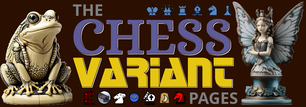
Here are two versions of the big logo for the homepage in dark mode. I put the first of these up last night, and I replaced it with the second one this evening. The main difference is in the fairy princess piece on the right, which is there to represent fairy chess. I really like the appearance of the first one except that the wings were bird wings instead of butterfly wings. Both the frog and the fairy princess are AI-generated art. I had generated the frog previously and chose it for being nocturnal. The piece on the right was originally a white locust, which was sort of like a cricket, which makes noise at night. I also changed more of the smaller pieces on the bottom.


One other thing I see now, the highlight colors on game courier logs seem wrong. It's too dark on light, and too light on dark.
I fixed the highlight colors by adding a new color to the color schemes called --highlight-color. I also modified --nav-highlight-color and --nav-border-color. I did some work on Game Courier colors, and I see I have more work to do, but I'll stop for tonight.
25 comments displayed
Permalink to the exact comments currently displayed.

The fonts are not from Yahoo! and have never been. They used to be from Google but are now from bunny.net.