Comments/Ratings for a Single Item
I have not tried dragonfly wings, but now that you mention it, I see that sometimes fairies are depicted with them.
@Fergus: frankly the colors are fantastic, this is true, but the content is not OK for me. Please don't take it bad and accept my opinion.
I don't think it carries the image I mentally attach to this site that I follow for more than 25 years now. Well, it's a matter of taste and I would like to see what other people think.
The frog and the fairy are cute but there are more figurines that we could find in any Toys'r'us store than bearing a chess character. There are 3D pieces around. Musketeer chess for example. Or we are several people designing Staunton-like 3D pieces for printing. Importing a .stl into Meshmixer we could make very nice 2D images. I could help if needed.
For the line of symbols, I think it is a good idea to have the line with the 6 characters on the top. But on the bottom, too bad that we don't have a true xiangqi piece, a true shogi piece , maybe a janggi one, along with some of the selected ones you have put. In term of message, I think it would be more universal.
the colors are fantastic
Thanks. The colors have gotten to the point where I am more comfortable writing this comment in Dark mode.
I don't think it carries the image I mentally attach to this site that I follow for more than 25 years now. Well, it's a matter of taste and I would like to see what other people think.
Indeed. I will bear in mind the story of the man, the boy, and the donkey. It can be hard to avoid naysayers whatever I do, but it doesn't mean I have to let them tell me what to do.
The frog and the fairy are cute but there are more figurines that we could find in any Toys'r'us store than bearing a chess character.
The Toys'r'us where I live is permanently closed, and these are AI-generated art, not photos of toys.
There are 3D pieces around. Musketeer chess for example.
Yes, the logo for the Light color scheme already uses them.
Or we are several people designing Staunton-like 3D pieces for printing. Importing a .stl into Meshmixer we could make very nice 2D images.
Those are suitable for going on individual Piececlopedia pages if someone would like to take charge of that. I'm not the one to do that, since I don't have a 3D printer or know anything about the image formats.
For the line of symbols, I think it is a good idea to have the line with the 6 characters on the top.
Chess pieces are on the top, because the word CHESS is above the word VARIANT, and the variant pieces are down below with the word VARIANT. If this site was called The Variant Chess Pages, then the variant pieces would be on top.
But on the bottom, too bad that we don't have a true xiangqi piece, a true shogi piece , maybe a janggi one, along with some of the selected ones you have put.
By true, I assume you mean traditional. The Shogi pieces should stay in the Motif style, because the images used for the Gold and Silver Generals also symbolize the sun and the moon, so that the sun symbol appears with the Light scheme, and the moon symbol appears with the Dark scheme. I am more flexible on others, though in no hurry to change them.
Or we are several people designing Staunton-like 3D pieces for printing. Importing a .stl into Meshmixer we could make very nice 2D images.
Those are suitable for going on individual Piececlopedia pages if someone would like to take charge of that. I'm not the one to do that, since I don't have a 3D printer or know anything about the image formats.
I nominate Jean-Louis. ;)
But on the bottom, too bad that we don't have a true xiangqi piece, a true shogi piece , maybe a janggi one, along with some of the selected ones you have put.
Since between the two logos, pieces from Eurasian Chess and Storm the Ivory Tower were represented twice, I changed the Eurasian Cannon in the light logo to a Big5 Chariot, and I changed the Ninny in the dark logo to a Korean Elephant.
The frog and the fairy are cute but there are more figurines that we could find in any Toys'r'us store than bearing a chess character. There are 3D pieces around. Musketeer chess for example. Or we are several people designing Staunton-like 3D pieces for printing. Importing a .stl into Meshmixer we could make very nice 2D images. I could help if needed.
While I do disagree that the source of the images is an important issue, I am beginning to think there was a real issue behind your response. What has come to mind for me is that the frog and this version of the fairy princess are not as clearly recognizable as Chess variant pieces as the main pieces in the logo should be. While I know that the frog has been used as a Chess variant piece, and I have myself used a frog image to represent the Long Leaper in Ultima, the average visitor to this site would not know that and may wonder what a frog has to do with Chess variants. Also, Chess has nothing like the frog in it, and this piece does not resemble any Chess piece apart from having a Chess piece base. Chess does have a queen, but this fairy princess image does not resemble a queen as much as some others I have generated.
To represent the idea of Chess variants to someone who is not familiar with the pieces being used, they should resemble Chess pieces while also differing from them in some ways. It may also be good to have two pieces that represent different branches of the Chess variant family. The Elephant and the Unicorn did this well, as the Elephant is common in historic and regional variants while a Unicorn is used in some modern variants.
What I have in mind is a dragon horse (or possibly dragon king) to represent Asian variants and a fairy princess (or possibly fairy empress) to represent fairy chess and western variants. A figurine dragon horse piece resembles a knight, and a fairy princess (or empress) piece resembles a queen. In the drafts hidden in the details section, the two pieces could be taken for a knight and a queen from fantasy-themed Chess sets.
Dark Logo Drafts


I'm not entirely happy with these drafts. While I think the fairy princess in the first two looks better on its own, the last one feels more balanced with the dragon horse and fairy princess facing each other. The main problem with AI art is that I don't always get exactly what I want. But it still does a much better job than what I could do on my own. So I may generate more images later and see if any of them turn out better.
I kind of like the Dragon Horse at the top and the Fairy at the bottom; I wonder how they'd look together.
I recognize that my comment was a bit too straight. When I read what you write, I think that we agree on almost everything. I support your view of which pieces should be shown here, for what they represent.
Where we disagree is on the use of these images made by AI. I know you like them, but I really don't. I see no homogeneity among the different ones you put here and also elsewhere. In my opinion, a good design should have a good balance between abstract and figurative. Staunton designs are excellent in this respect. Although, some sets may have Knight's designs which go too far.
The AI is trying to make a nice design of what you ask, plenty of tiny details. And this is what it goes away from what should be. It is not abstract enough and indeed sometimes they look like toys.
I know some chess sets are very figurative, also like toys, and some collectors like that. But this is not what most chess players want. I have not the pretention to be an artist but I really prefer my Lion, Eagle, Camel, Medusa, Cannon, Giraffe, etc.
That being said, this CVP is your website, to you more than to others given the strong involvement you are putting in, so if you like these images, use them after all.
 H. G. Muller wrote on Sun, Mar 10 04:18 PM UTC in reply to Jean-Louis Cazaux from 04:09 PM:
I agree completely with Jean-Louis. There is a large difference between chess sets intended as tools for playing chess games, and sets intended for display by collectors. The latter are actually not chess sets at all; they are works of art inspired by chess.


(Images from the Chess-Piece Museum in Rotterdam.)
I kind of like the Dragon Horse at the top and the Fairy at the bottom; I wonder how they'd look together.
Like this:

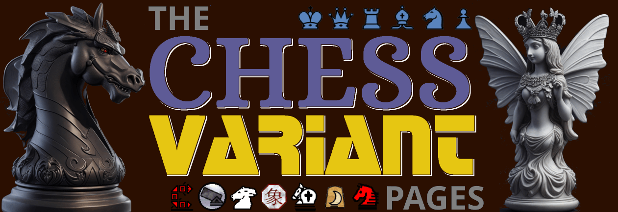
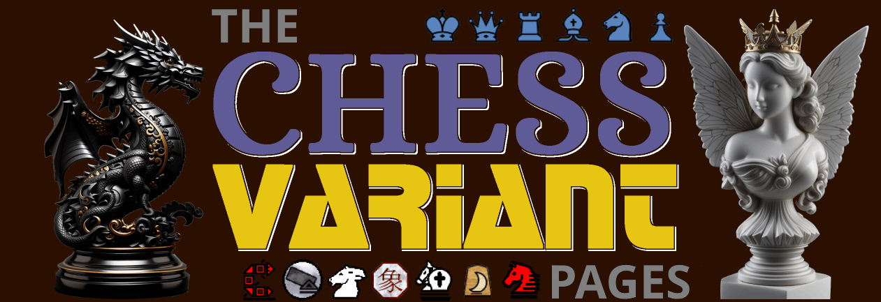
And here is a new one with new images. For this one, the pieces are a fairy empress and a dragon horse.

I got a paid subscription to Leonardo.Ai today, and with that, I was able to use the bird-winged fairy princess image I otherwise liked to generate similar images with butterfly wings. Using one of these, I made this logo:

There is a large difference between chess sets intended as tools for playing chess games, and sets intended for display by collectors. The latter are actually not chess sets at all; they are works of art inspired by chess.
While I agree that some Chess sets are more suitable for playing the game than others are, this wasn't the pertinent issue. The Chess variant pieces flanking the logo are not Chess pieces, and they will not be used to actually play Chess. Instead, they serve the decorative purpose of conveying the idea of Chess variants, and this purpose has its own criteria.
First, they should bear enough of a resemblance to what people commonly think of when they think of Chess pieces. For this purpose, resembling Staunton pieces works best, though the reason is for the strong association between Staunton pieces and Chess and not for the superiority of Staunton over some other design. Despite being anthropomorphic, the current Fairy Princess bears enough resemblance to the Staunton Queen for someone to spot the similarity. In the same way, the Tenniel illustrations of the Red Queen on the 404 page also resemble a Staunton Queen. Despite being more fully figurine, the Dragon Horse resembles the Staunton Knight enough to look like some kind of Chess variant piece.
Second, they should differ from the Staunton pieces in some significant way. The Dragon Horse has enough dragon features to tell it's not an ordinary horse, and the Fairy Princess has butterfly wings. These features help evoke the idea of being different from the usual Chess pieces we are normally familiar with.
The Dragon Horse in your last picture is fearsome looking, although somehow it reminded me of a raptor dinosaur (though not saying it's not okay).
The Dragon Horse in your last picture is fearsome looking, although somehow it reminded me of a raptor dinosaur (though not saying it's not okay).
I imagine dinosaur bones helped contribute to the belief in dragons. The Dragon Horse differs from the raptor by having dragon wings, having its forelimbs lower down its body, and having a more serpentine appearance.
A modern-day real life kind of dragon:
The new small logos on each page except this one are flanked by small 2D representations of the AI art pieces flanking the corresponding big logo from this page. The Elephant appears as a Korean Elephant, and the Dragon Horse appears as a half-Kanji Shogi piece, each using a single Chinese character that is also used in Chinese Chess. The Unicorn appears as a Unicorn, and the Fairy Princess is represented by the Princess, which is the Knight-Bishop compound.
I have flushed my cache (I think) and I cannot seem to find what you wrote about, in the way of new small logos etc., on any page I've checked so far, Fergus (I'm using my laptop).
I have flushed my cache (I think) and I cannot seem to find what you wrote about, in the way of new small logos etc., on any page I've checked so far, Fergus (I'm using my laptop).
The code for it is in the header. So, try going to a new page you haven't been to.
I've tried a few such new pages for me, but no difference. Do I need to click on (or mouse over) something? If so, where? Not sure what you mean by the header of a given page.
It should be visible in the top left corner of each page, and it should look like one of these images:


By header, I mean the header script, which is included on each page. So the code for it is right in the source code for the page, not in some CSS file. As long as you aren't looking at a cached copy of the page, you should see it. And if you're reading this on the comments page, you should see it on that page. Note that which logo you see will depend on your color scheme, and you will have to switch color schemes to see the other one.
Ah. Well, I've been seeing just the one on the far left, which has the Korean Elephant symbol, in red, plus the (old) blue unicorn. I do see both, in just your comment I'm replying to. I've never bothered to switch colour schemes, but I can try that sometime. Right now I've a got a long phone call to make.
I see the logo (with archbishop) closer to the right in your comment only when I switch to the Dark Colour Scheme - unfortunately some other parts of my screen I find (at least initially) unpleasant to look at, on my laptop. The Light and System colour schemes (if there is a difference) both show the logo on the far left, i.e. with the blue unicorn, again when on my laptop.
I have an iphone I use occasionally at my local bar and grill for visiting CVP site a bit, but I do not see the full CVP site when viewing CVP on it - I'd have to do some sort of downloading of an app to even hope to start to do so. I also (by choice?) do not have my phone defaulting to a dark background all of the time that I am on the phone anywhere.
I see the logo (with archbishop) closer to the right in your comment only when I switch to the Dark Colour Scheme - unfortunately some other parts of my screen I find (at least initially) unpleasant to look at, on my laptop. The Light and System Colour scheme (if there is a difference) both show the logo on the far left, i.e. with the blue unicorn, again when on my laptop.
That's how it should be. The Princess is the same piece more commonly known as an Archbishop. The System color scheme uses the color scheme set in your browser settings. This is Light for you, and it is Light for those who have never set it, but some people have set it to Dark.
I have an iphone I use occasionally at my local bar and grill for visiting CVP site a bit, but I do not see the full CVP site when viewing CVP on it
To save on bandwidth, mobile pages do not include the comments. But you can read them by clicking on a link.
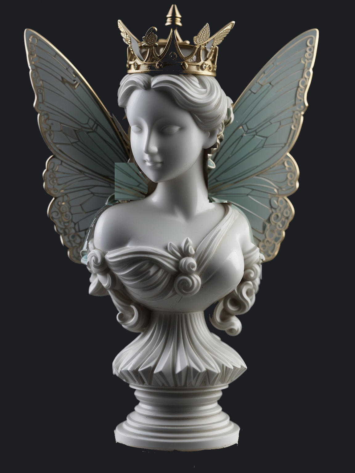
I made some further modifications to the fairy princess image. I got the wings to look much more like butterfly wings. To do this, I copied some butterfly wings from an image that was otherwise too different from the original. I also edited out the pedestal so that it wouldn't be part of the image. Using this rough patchup job as my source image, I generated some more images and found one I was satisfied with.

25 comments displayed
Permalink to the exact comments currently displayed.

The result is spectacular.
Have you tried dragonfly wings?