Comments/Ratings for a Single Item
I agree with your 2) and 3), especially 3). Unfortunately I never made any Nightrider so far. This because I don't like leaper-runners which are difficult to predict on board. But I might do one, one day, as well as the Grasshopper.
I would add another criteria: the 3D piece which is represented should be realistically 3D-printable and not too fragile.
@Bob: which viewer or software do you use to get those images? Blender? or something else, maybe more friendly?
I'm opening the STL files in Paint 3D. Using the 3D view, make the canvas visible and expand it to 8000x6000, and it can be any color desired with the paintcan "fill" function (as can the piece itself).
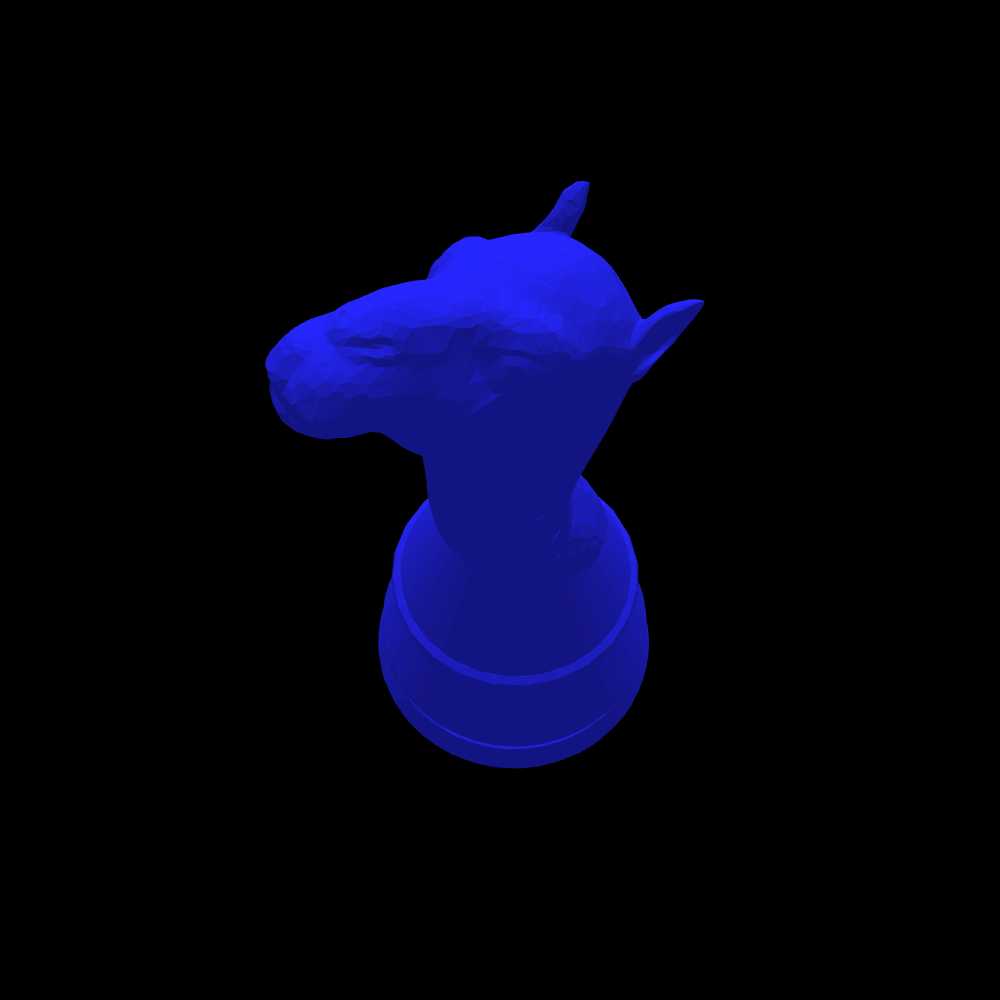
So, should I use #0000FF or another shade of blue?
Whatever you have been using is fine, or you could use the same color as the Alfaerie pieces use, which is #5984BD.
I was thinking, in keeping with the row of figures across the bottom of the Light-themed logo, to make the pieces different colors (nothing outrageous; mainly ivory, tan, grey, muted red, that sort of thing that you might see in an actual chess set).
While the Darker scheme can be used on monitors, tablets, and phones, I designed it mainly for monochrome eink displays, and my Likebook Mars eink device renders red as black. So colors with mostly red will not work out well on that or similar devices. Since blue is used for the Alfaerie pieces and shows up well on my Likebook Mars, I figured it would be a good choice.
I figure to leave any resizing and cropping to your (probably more capable) hands.
I suppose if I resize it against a black background, it will look fine.
OK, well, here's my shot at a Nightrider image. If this works for you, I'll get to others tonight and/or tomorrow.

I would add another criteria: the 3D piece which is represented should be realistically 3D-printable and not too fragile.
I would presume that anyone who makes 3D pieces is already keeping that one in mind. Since I don't have a 3D printer to test pieces with myself, I will leave it up to you and Bob to judge whether your pieces fit this criterion.
I meant a blue piece on a black background.
Mostly Jean-Louis, since mine's (still) broken.
I meant a blue piece on a black background.
Ah, OK. I'll do that with all of the pieces you asked for (plus a couple others) this evening. (Right now it's time for me to log off for a while.)
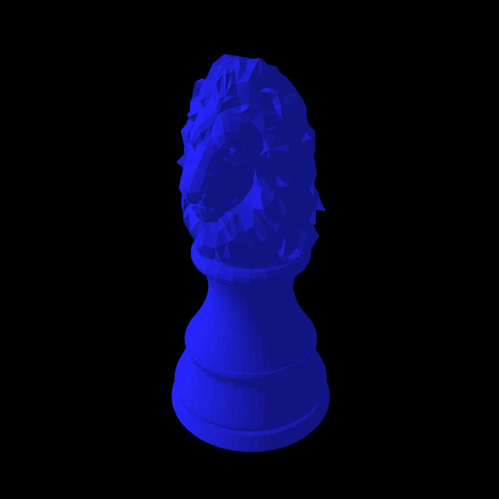
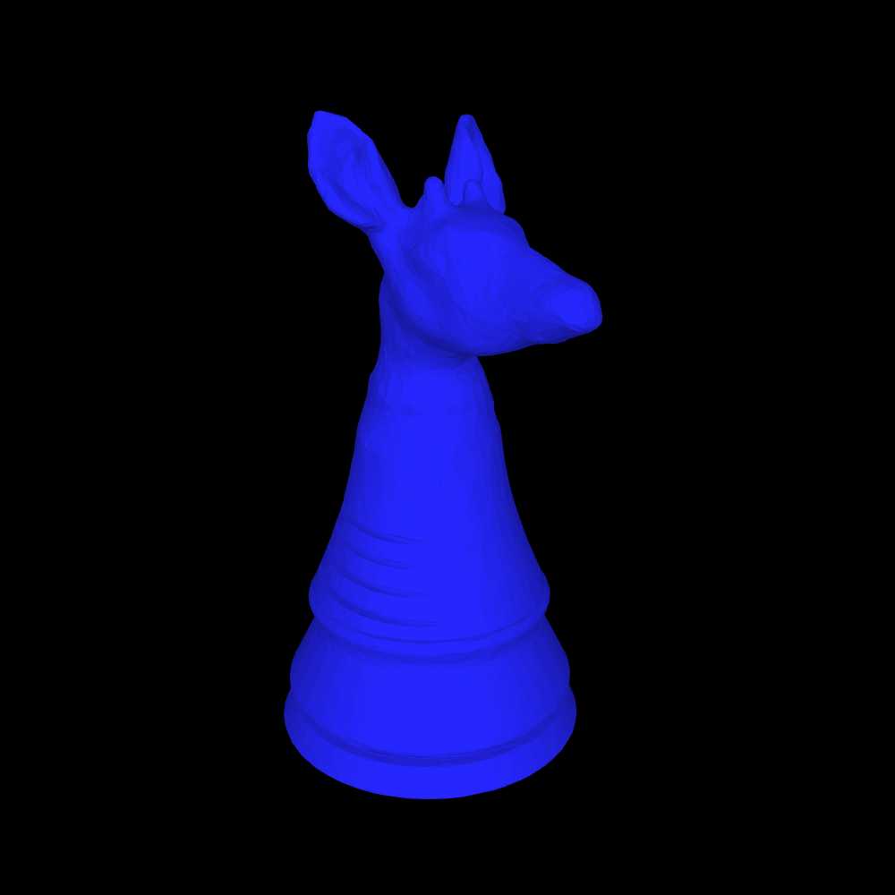
Here are the requested pieces (some are overwritten from before, so you may need to flush the cache):



I'd suggest using only one Knight variant and only one moon-topped piece in the lineup; offhand I'd choose the Midnighter and Thaumaturge.
And a few others, sorted roughly in order of importance to include (as I see things, anyway):
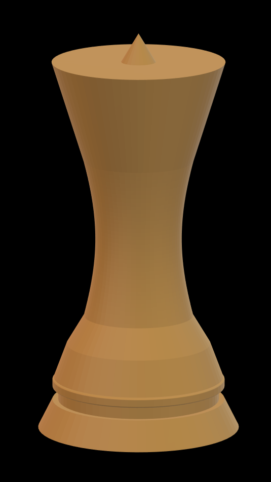


Hold off on that Midnighter; I need to update it with better wings.
@ Fergus: I have made images of some of my 3D pieces in blue on black background. I wished to upload the images but I lack space to do it. So I wanted to create a fake page named "Cazaux Vault" to get some room where to upload but I get this message:
"As a veteran contributor with nine or more submissions published so far, you are limited to submitting nine of your games for review and publication at a time. If you would like to post more, cooperate with the editors to get your submissions accepted, or revert something to a work-in-progress and submit something else."
What is this? I don't have 9 games in waiting!?
Does that mean I cannot create any new page?
Here the images you asked Fergus. The blue might be too saturated.

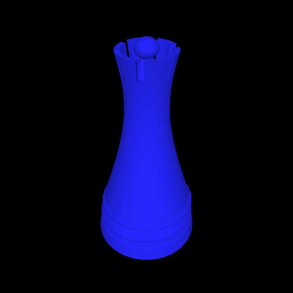


@Bob: I have used this on-line viewer which is working very nice. I recommend, you can easily change the background, the color of the piece, the size of the snapshot, etc.
I wasn’t expecting either of you to change the color of your pieces. I envision the logo as having a white piece supplied by you and a blue piece supplied by Bob.
Additionally, I just looked at these pieces on my Likebook Mars, and they fade into the background too much on it.
I also face this problem and cannot submit new pages…)
I was comparing these on both my iPad and my Likebook Mars ereader, and on the latter, they all appear as grey on a black background. From the Thaumaturge on down, there are sharp contrasts between different shades of grey that look kind of random and ugly. I’m not sure if the horse shape of the first few pieces just leads to a more pleasing shading or if you did something different in the pieces following them, though I suspect it is the shape that makes the difference.
@ Fergus: well, it's a bit your fault Fergus. You asked both Bob and me and then it was not possible to understand that you were not speaking to both of us. About the color, I first understood that you wanted pieces on a blue background, so did Bob, then that you wanted blue pieces on a black background. If you prefer white pieces on a black background it is not a problem at all.
Actually, there is something VERY simple to do, a piece of cake for you. You go to:
https://www.thingiverse.com/kazo65/designs
There you can download the .stl of the piece you would like.
Then you open that .stl with:
And you can have a snapshot of that piece with the color you like, the background you like, the orientation you like, the size you like, etc.
If you can't do that and need help, please tell me exactly which piece/color/background you would like, I will make it for you.
I think you're right about the shapes making the difference. I think I'll try them in a medium brown (I'd go for tan, but apparently I'm the Black player), and maybe add a couple of angular pieces.
"I just looked at these pieces on my Likebook Mars, and they fade into the background too much on it."
I don't have a Likebook Mars, so I don't know what you mean.
I just uploaded wood-brown versions of everything, plus four new pieces.




Hopefully, brown works at least a little better.
I don't have a Likebook Mars, so I don't know what you mean.
It is an Android tablet with an eink display intended primarily for reading. The important thing you need to know is that it displays everything in black and white eink, which has even fewer gradations of grey than a grey monochrome image on an LCD monitor would have. Since I made the Darker color scheme for use with it, I am testing how the images intended for this color scheme look on it.
Also. Anybody hears us?!
25 comments displayed
Permalink to the exact comments currently displayed.




So, should I use #0000FF or another shade of blue?
I was thinking, in keeping with the row of figures across the bottom of the Light-themed logo, to make the pieces different colors (nothing outrageous; mainly ivory, tan, grey, muted red, that sort of thing that you might see in an actual chess set).
I figure to leave any resizing and cropping to your (probably more capable) hands.